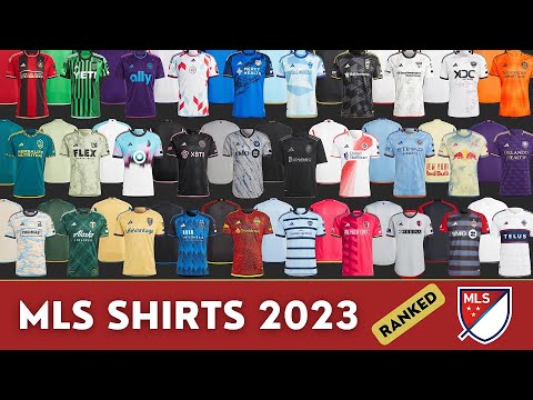
In honor of Major League Soccer`s rich history, the league has unveiled its MLS Archive Collection, featuring 10 new retro-inspired jerseys for various clubs. While some of these designs successfully evoke classic eras, others push the definition of “throwback” a bit too far. For founding MLS clubs celebrating nearly three decades of existence, or those whose team identities have evolved, a trip down memory lane makes perfect sense. However, for newer franchises, the concept becomes more questionable.
This isn`t a new phenomenon; last season, even Inter Miami, a team that only debuted in 2020, received a throwback kit. Although aesthetically pleasing, it felt premature for such a young club. Yet, with Lionel Messi`s influence, seemingly anything is possible. This season`s collection includes an even more egregious example: a team with only three seasons under its belt. Regardless of their origins, new jersey releases demand a ranking, so let`s delve into them, from least impressive to most.
10. Charlotte FC
This kit presents a rather chaotic design, with most elements falling short. While the crown logo stands out positively, the overall aesthetic strongly resembles that of the Seattle Sounders. Furthermore, the decision to give Charlotte FC a throwback jersey, considering they only commenced play in 2022, is perplexing. While Charlotte boasts a deep soccer heritage, this particular club lacks the longevity to warrant a retro design. Even purely from a design perspective, this kit leaves much to be desired.
9. Nashville SC
Following Charlotte`s lead, Nashville SC`s inclusion is also debatable, though they possess a slightly stronger claim given their origins in the United Soccer League. However, this jersey appears to be a whimsical, uninspired creation, as if someone uttered “Groovy baby” and called it a day. Despite Nashville`s otherwise appealing color palette and track record of decent alternate kits, this specific design feels like a haphazard application of random elements onto a plain white shirt.
8. D.C. United
Currently, there isn`t much excitement surrounding D.C. United`s men`s team, and this jersey does little to change that. While it`s a historically significant kit, harking back to their inaugural season, it lacks any visual flair. Fans who appreciate minimalist classics might find it acceptable, but the collection features far more compelling designs.
7. New England Revolution
This New England Revolution kit is by no means poor, and the integration of the distinctive “crayon flag” motif across the upper half is a clever detail. Nevertheless, it gives off a sense of incompleteness, as if a key element is absent.
6. Colorado Rapids
What might otherwise be a rather unassuming jersey for the Colorado Rapids is elevated significantly by an exceptionally well-designed logo. It would be fantastic to see the Rapids adopt this emblem permanently, but even its temporary return to their kit rotation is a welcome sight.
5. Columbus Crew
Similar to the New England kit, the Columbus Crew`s jersey also feels somewhat unfinished. However, its overall rhythm is improved by the choice of colors, which subtly evoke a miner`s aesthetic, aligning with the team`s logo. This clever detail gives it a slight edge, but a significant quality gap separates it from the top four entries on this list.
4. Seattle Sounders
The Seattle Sounders` orca logo is absolutely fantastic—a standout feature. The kit`s colors and trim are beautifully chosen, and the design elements on the sleeves further enhance its appeal. Seattle consistently produces excellent jerseys, and this new addition proudly upholds that reputation.
3. Minnesota United
It was genuinely challenging to resist placing this Minnesota United kit at the very top. Every detail, from the typography and numbering to the impressive gradient, is impeccably executed. Minnesota United clearly delved into their past to create a design that not only pays homage to their history but also looks incredibly striking on the field.
2. San Jose Earthquakes (Clash)
The “Clash” era of the San Jose Earthquakes truly had an iconic name, and its absence from regular use is regrettable. This jersey, however, perfectly encapsulates the vibrant spirit of the 1970s. It`s a bold and energetic design that elicits strong reactions – you`ll either adore it or detest it, with no middle ground. While nostalgia might have influenced its placement above Minnesota, as the arbiter of these rankings, I stand by the decision.
1. FC Dallas (Burn)
The “Burn” identity is another rebrand I`d love to see reinstated permanently; FC Dallas absolutely hit a home run with this one. While it`s a slightly more understated design compared to the flamboyant “Clash” kit, its versatility makes it an outstanding jersey suitable for both on-field action and casual wear. Plus, that logo is simply fantastic.